Comparing Survey Creation Platforms
How 'Studo Survey' outperformed Google Forms in terms of UX
Can custom development still shine in a world dominated by SaaS?
Third-party tools are easy to set up and require lower initial investment. Having one company that dedicates resources towards creating a product to be sold to many others often means this product is more polished than something that would have been developed in-house. It might cater to more use-cases, have more features and is updated more frequently, as the producer has an incentive to keep selling it and to innovate. However, third-party tools mostly offer no or limited integration with existing infrastructure. For example, Google Forms was not designed to be integrated into an exsting web application.
On the other hand, developing a custom tool for use within the company allows it to be developed exactly to meet custom requirements. Resources can be allocated to optimizing the most important user flows and use-cases. Additionally, the tool can be integrated into existing infrastructure much more easily. For example, a new reporting tool that gathers statistics logged by systems within the company can be integrated to be accessible right where users would expect it to be. No third-party domain to remember, no separate login to create.
The Studo Newsroom is a communication tool used by universities and company partners of Studo. It allows creating posts that are published to a community of over 300 thousand students using the app, delivering important university news and the best local student deals. After we decided to implement a survey tool to make the news feed more engaging, I evaluated SaaS survey tools like Typeform, SurveyMonkey, Google Forms as well as SurveyJS (a collection of libraries used to add survey creation and publishing functionality to existing projects).
# The three survey creation platforms
After the evaluation, I created the custom-built solution “Studo Survey”.
I compared it against two third-party solutions, Google Forms and SurveyJS, hypothesizing that Studo Survey would score well when comparing it to the other tools on key metrics and using an A/B test. Each has a different goal and different advantages. Specifically, the UX of creating a survey, the user-facing page load time and response rates were compared.
# Studo Survey

The survey creaeator interface has the goal of being simple to use, allowing a range of users with widely different expertise to easily create a survey. It can be accessed from within the Studo Newsroom when creating a post.
The main content is the list of questions of the current survey, while there is a live preview floating on the right side, of what the survey will look like from the respondent’s perspective. Questions can be of multiple types, including multiple choice and single choice, free text and quiz format. There’s also the option of inserting an info text, which for instance could be used to explain the topic of the following questions. Survey items also have additional settings, such as marking them as optional.

After gathing some responses. The results can be viewed in a list which shows each question with a bar chart or table, depending on the question type. Choice-questions also have the option to view the responses as a table.

Surveys can now be filled out right in the Studo app’s news feed.
Like most of Studo’s web projects, the survey creator is written in KotlinJS and transpiled to JavaScript. Kotlin provides a number of benefits for developers, especially smaller teams. Everything is type checked and, because we can access the same class from both backend and frontend code, API contracts are kept at the compiler level. We use React through a Kotlin wrapper that ensures type safety for all properties and functions.
# Google Forms

Google Forms is a tool included in Google’s popular ‘Google Docs Editors’ suite of web applications. As most other products of the search engine giant, their survey creation tool is free to use. Unlike competitors such as SurveyMonkey or Typeform, Google Forms does not place strict limits on the number of surveys a user can create or the amount of responses a survey can receive.

When creating a new survey, each question is laid out on its own card, which can be dragged to change the order of questions. ‘Sections’ can be used to split longer surveys into multiple steps. All questions in one section are shown in a list view and the user is can navigate to the next section freely. There is a variety of different question types, such as free text, multiple choice, checkboxes, linear scale, dropdown and even a file upload option. This allows creating surveys or forms of many different styles and requirements.Google Forms also offers some customization options, like setting a custom theme or a header image for the survey.

Once a survey has been published and received a few responses, they can be analyzed by heading to the ‘responses’ tab of a survey. Just like the editing view, it shows a survey’s responses in a list, each with appropriate visualisation via graph or table.
# SurveyJS
“A robust full-cycle survey and form solution for your JavaScript application”
SurveyJS is made up of multiple modules that work together around the concept of providing your own database to store survey structure data as well as responses. These modules are the ‘Survey Library’ (allows users to fill out surveys), the ‘Creator’ and the ‘Analytics’ module, all readily available for easy installation via npm, alongside integrations for popular app frameworks like Vue or React. While the libraries are open source, a license must be bought for commercial use.

The survey ‘designer’ allows creating surveys. It lists questions, categorized into pages, equivalent to Google Forms’ sections. However, configuration options for the survey itself, as well as questions and question types go much further than the other two tools. Each component can be tweaked, styled, expanded and configured to one’s content. There is a plethora of simple and advanced question types available, including matrix, rating, boolean, image picker, signature and more. The survey can be previewed at any time, to see how it will look to the user.

The ‘Preview’ tab allows previewing the survey as it will look to the user. The design is very adaptable, but the structure of the survey is primarily geared towards desktop use, with the mobile UX being significantly worse. The third tab is allows configuring advanced logic to show or hide questions based on previous answers or other conditions. Clicking on the ‘JSON Editor’, the last tab, allows editing or copying the survey’s JSON structure, which is the format in which the survey is stored. Lastly, the analytics module of SurveyJS wasn’t part of the comparison, but is still worth mentioning. Just like the survey editor and runner, the diagrams used to display collected responses can be heavily customized and the page’s theme can be matched to the enclosing tool or preference.
# Doing the Real Science™️
What are the advantages of a custom-built survey platform, compared to third-party solutions. To answer this question, it is assumed that someone creating a survey cares about the user experience offered by the survey creation interface and the survey’s response rate. A user responding to a survey might care about how fast the page loads and how much data it requires to load.
The three hypotheses this thesis aimed to answer are:
Hypothesis
Comparing the custom-built solution to the other two solutions in similar conditions should lead to a higher response rate. This would be due to its mobile-friendly design and low friction to fill out, i.e. few users leave the survey before completing it due to poor UX.
When answering a survey, users can go through multiple steps, e.g. opening, interacting, completing and closing it. This is the survey funnel. To answer this hypothesis, an A/B test was conducted, during which surveys created with each tool were randomly distributed to users of the Studo app. The number of users at each step of the survey funnel was recorded and compared between the three tools.
Hypothesis
KPIs related to the performance of the website that displays the survey fill-out view should also be better, since the scope of the custom-built solution is smaller than that of the other solutions.
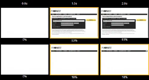
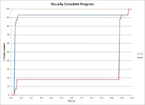
The performance of the survey fill-out view was measured using the Lighthouse tool. This tool is used to quantify the performance of websites and provides metrics such as: Time to Interactive, the time it takes for the page to become interactive, and SpeedIndex, how quickly the page contents are visually populated. The above image shows a visualisation of how SpeedIndex is calculated and on the right a graph of SpeedIndex progressing for the two examples.
Using these metrics, the performance of the survey fill-out view was compared between the three tools.
Hypothesis
The survey creation interface is expected to offer a better user experience. This would be because of its integration into the existing tool Studo newsroom and it being easy to use and designed for the specific use case of creating surveys to be displayed on mobile devices, inside the Studo app.
An unmoderated user test was performed to compare the subjective UX of the three tools. The test consisted of a user being asked to create a survey using each tool and then answering a few questions about their experience comparing the three tools.


# Response funnel comparison
As described above, a user filling out a survey goes through a so called funnel. First, they see the survey, triggering a viewed event. Then they may choose to open it, and afterwards interact with it (i.e. tap any element). Finally, users may complete it and then close it. The total duration between open and close is called the completion duration. At each step of the funnel, the user can decide to leave the survey. The goal of the A/B test was to compare the drop-off rates between the three tools.
When the page completes loading, the ‘opened’ event is sent. But logging the ‘interacted’ event proved difficult for Google Forms, which was integrated using an iframe element. Browsers implement CORS protections to prevent malicious websites from detecting clicks on other websites. In this case, it prevented the enclosing page from detecting onClick events on the iframe. To solve this, a screen displayed before the actual survey, containing only a ‘start’ button, was added. Clicking the button was then used to indicate when the user interacted with the survey.
Detecting when a Google Forms survey was completed was also difficult. Again, due to CORS measures implemented by modern web browsers, detecting when the user clicked the ‘submit’ button was not possible. Accessing any data of the iframe that might hint at the survey being completed, like the URL changing or the content height changing, is restricted by the browser. No workaround for this could be found, so instead of logging the completed event manually, the number of users who completed the survey, as reported by Google Forms, was used.
The ‘closed’ event was logged when the onbeforeunload event occurs. The problem here was sending the event to the server. Since the page is unloading when the event fires, i.e. about to be closed, any http request sent would be cancelled before it could be completed. To solve this, the event was sent using the navigator.sendBeacon API, which allows sending requests even when the page is unloading.
To conduct the A/B test, three posts were published to users of the Studo app in August 2022, each post containing a survey created using one of the three tools. The surveys were distributed randomly to users, so that each user received a survey created using one of the three tools. After around 48 hours the posts were unpublished, each post had reached the target of receiving ca. 14,000 impressions.

Since the surveys were distributed randomly, one would expect the percentage of users opening the post to view the survey to be the same for each survey. Unluckily, this is not the case for Studo Survey, which has a 40% lower open rate, compared to the other two tools. The small sample size introduces more noise, which makes it harder to draw conclusions.
Interestingly, Google Forms performed worst in the completed rate, with 44.2% of users who interacted with the survey closing it before sending a response. This could indicate that users were not motivated enough by the survey fill-out experience to complete the task.
The median completion duration of the Studo Survey is 15 seconds higher than that of the other tools, which may be attributed to displaying one question per page, compared to the list view used by the others. However, considering Google Form’s low rate of completion, this could also indicate that its responents drop off early after seeing the survey’s length, which isn’t as apparent in the Studo Survey.
# Page load speed
Measuring page load time is not straightforward, but SpeedIndex and `time to interactive’ are decent metrics. SurveyJS was measured the way it would be deployed in a production environment. This means that the survey runner library is integrated into the Studo Newsroom, Studo’s existing react-based project. It has some additional overhead, as the enclosing project needs to load before the actual SurveyJS runner library can load. The same applies to the custom-built survey fill-out view. As common with React apps, page first loads the app’s JavaScript and displays a spinner, while in the background, a network request is made to download the requested survey’s structure, which is then rendered by the client. Google Forms was also enclosed in the existing Studo Newsroom project for measurement purposes. In real-world use, the link to a Google Forms survey would be distributed directly, without being embedded into the Studo Newsroom project, so this was used to measure its performance.
The test was performed using webpagetest.org. It offers Lighthouse testing using emulated devices with consistent CPU power and a stable and consistent internet connection. The SpeedIndex and `time to interactive’ values that the performance test measured are displayed in the table below.

Unlike the other two tools, Google Forms uses server-side rendering, which explains why it has the best (lowest) SpeedIndex - the HTML is prepared on the server and sent to the client. As explained above, Studo Survey and SurveyJS both first load only the app’s JavaScript and then make a network request to download the survey’s structure. They need a second network roundtrip and also the browser needs additional time to parse and execute the app’s code to display the survey. This is why they have a worse SpeedIndex than Google Forms.
# Survey creator UX
Studo survey’s creator interface was perceived as being most user-friendly, intuitive and self-explanatory. The live preview shown beside the editor was perceived as an advantage over the other two tools, which require the survey creator to switch to another tab to view the preview. The goal of being an easy-to-use tool for creating surveys, to be used by employees and company partners alike, is met. Its limitations lie in that minimalism - there are only a few question types and currently no way to insert images or customize the survey’s appearance.
Google Forms was perceveived to be easy to use, most so by those who had used it in the past. New users found some aspects of creating a survey unintuitive. It has theming support and other question types, but it is not as intuitive to use as Studo Survey. SurveyJS got some positive feedback for its very large degree of customizability, like customization, advanced question types and enabling dynamic surveys through its logic editor. However, users felt having this many options makes it harder to quickly and easily create surveys. The sheer amount of information displayed at once intimidates first-time survey creators.
This user test was performed in remote and unsupervised fashion. Five representative participants were selected and asked to create a survey using each tool and to then report on their experience by answering open-ended questions on the advantages and disadvantages of each tool.
# Conclusion
For decades, big companies mostly favored on writing their own software, but in recent years many new companies have come onto the market with SaaS products. Developers can use AWS instead of buying and configuring their own servers, Google Drive or Dropbox replaced many insecure FPS servers and for many companies, Slack has replaced communication via E-Mail. Since the companies creating these tools want to retain their customers, most tools not only replace existing software, but also provide regular security updates and add more features.
This being said, the comparison done in my bachelor thesis showed that Studo Survey is a viable alternative to the other two commercial products. Its creator interface is easy to use, proving hypothesis 3. It outperforms Google Forms in user retention when filling out the survey, but loses to it when comparing page performance, so hypothesis 1 and 2 could not be fully proven true. In order for the survey view to be displayed inside the Studo app’s news feed, some quick adaptations had to be made, a big benefit of having full control over the tool.
Concluding, while deployment of SaaS tools is steadily increasing, custom development still has its merits, being built to meet specific requirements and allowing for easy adaptations. Whether it pays of in the long run still remains to be seen, as currently it’s hard to estimate how much resources will need to be spent on future improvements, fixes and other maintenance.