Ever tried planning an activity with three or more busy friends? You know how hard it can be. It inevitably takes a dozen messages going back and forth, trying to find out where your schedules align.

How it works:
Create a new meeting
Select your free time slots
Share the link with your friends
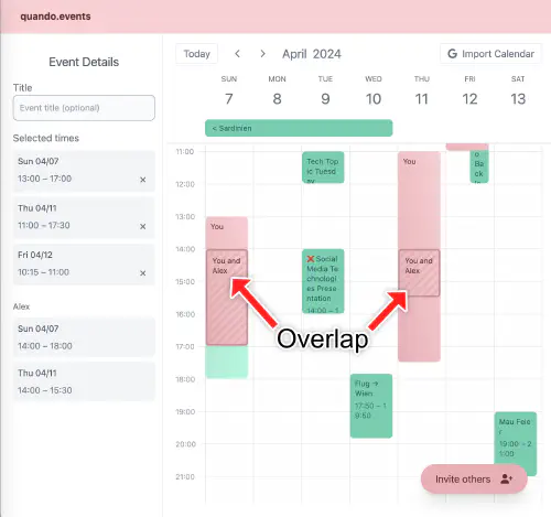
Meet in the overlap
Keep on reading to learn more about how I did it, or try it out now: Create a new meeting.
# Concept
When starting to create the project’s concept, the goal was to focus on an MVP and keep complexity as low as possible. The initial name was ‘meet me’, which got superseded by ‘quando events’ later on.
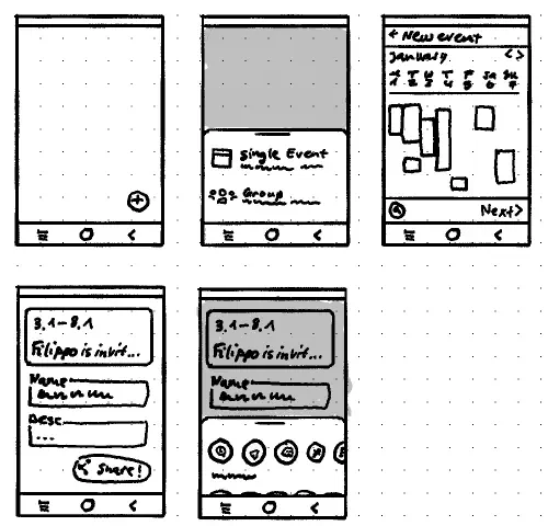
For the first UI sketches I drew, I wrote down these notes:
Main flow: ‘share free time slots with a group’
- I can see my Google Calendar & other calendars
- Button ‘Share free times with group’
- Drag to select (30m increments)
- Generate custom link & share via e.g. WhatsApp
- Other people can open the link to view my availability and add their own availability
- When others add their time slots, I get a push notification
The sketch shows five screens:
- Home with ‘add’ button
- Bottom sheet to select ‘single event’ or ‘friend group’
- Calendar view to select free time
- Edit event details
- Share with friends.

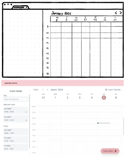
In the second sketch, I simplified the layout but still kept the three distinct steps to create a meeting: ‘your name’, ‘select times’, and ‘invite friends’. The released version differs a bit, but the simple concept is still present. The biggest change was merging multiple screens into the calendar view by using dialogs for different actions (import calendar, or invite friends).

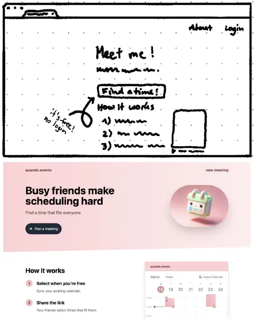
To design the landing page, I asked myself a few questions and tried presenting the most important information first.
On first open, I need to explain:
- What is this for?
- What’s the benefit?
- How does it work?
- What’s the catch?


# Tech
I went from the idea to release in just 10 days. Usually, I work with React, Flutter, or static websites, but for this project, I wanted to try out a new stack. I went with Nuxt, a meta-framework that bundles Vue with a backend and some other helpful bits into one compelling package. It offers great DX and enables extremely fast iteration.
Stack:
- Frontend
- Vue 3 for all UI. Includes server-side rendering with hydration.
- Typescript, because if I have to use JS, I’d like to have types, please.
- Tailwind CSS, for maintainable styling.
- Pinia, for managing state and persisting to local storage.
- Backend
- API: Nitro with Websocket support, for sending real-time updates.
- Database: Redis as a simple key-value store for the meeting data.
- Plausible Analytics because it’s privacy-friendly and can be self-hosted
- DevOps
- Hetzner for my cheap VPS. It powers all my services, including this website, quando events, my Four in a Row game, and more.
- Traefik to proxy requests to the service.
- Docker Compose to easily build and deploy the bundled Nuxt app, Redis, and Plausible.
# About Nuxt & Vue
Honestly, working with Nuxt was really pleasant. I’ve read that “opinionated products breed passionate customers” and this certainly rings true in the case of Nuxt. If you follow the conventions, everything just works.
Routing is based on directories by default. Server-side rendering works out of the box, which is important for good SEO and fast page loads. Of course, you still get all of Vue’s reactivity after the page is hydrated, enabling highly interactive pages.
Vue offers a lot of useful built-in components, like transitions. Adding dialogs with Headless UI was a breeze.
# Challenges
Funny enough, the hardest part wasn’t building the rather complicated calendar UI. Instead, it was getting Google’s approval for the ‘import events’ functionality. There are lots of rules to follow. Some are obvious (add a privacy policy), and some aren’t (make sure to show the ‘AppId’ in the browser’s URL bar in your demo video).
# More
- Read how I redesigned this website.
- Learn more about me.
- Check out my other posts.
- Find me on LinkedIn.