I was inspired to redesign and polish all parts this website. The landing page, the blog overview, and the reading page.
In this post, I explain my thoughts behind the decisions for layout, logo, fonts, and animations.
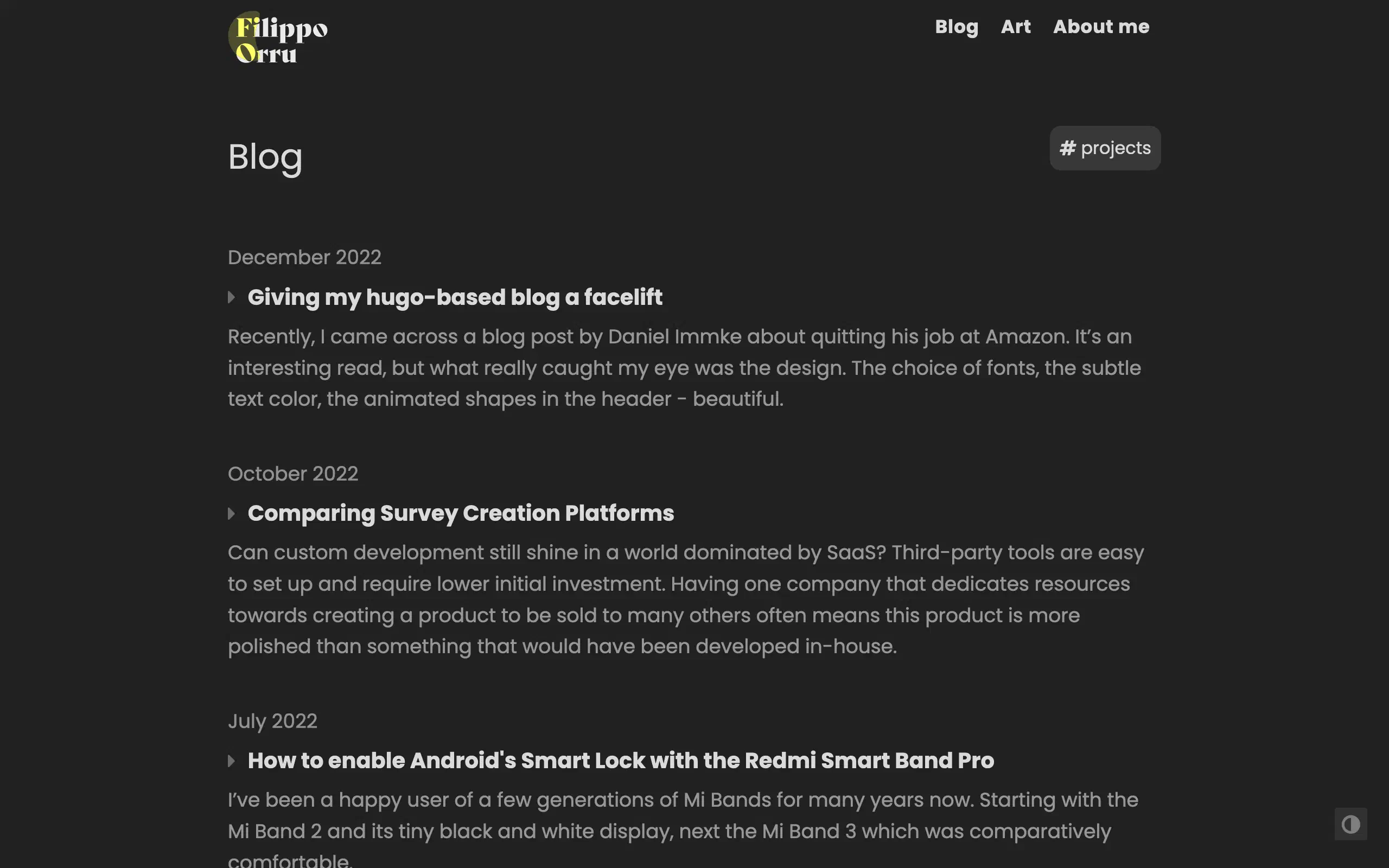
Recently, I came across a blog post by Daniel Immke about quitting his job at Amazon. It’s an interesting read, but what really caught my eye was the design. The choice of fonts, the subtle text color, the animated shapes in the header - beautiful.

Suddenly, my own blog felt antiquated and stiff and I felt inspired to improve its design. I’ll talk about how I completely redesigned the blog listing page and my search for an expressive font. I designed a logo for the site and added a place to showcase some humble art. If the before–after comparison caught your interest, stick around to see how I did it.
- Redesigning the list of blog posts
- Finding a font
- Designing a logo for the home page
- Joyful animations
- A place for art
# Redesigning the blog
I was almost done writing this article, when I decided to redesign the blog list page. I wanted to make it more appealing and include a summary of each post, so the layout had to change. Previously, I had two separate pages for projects and blog posts, but I decided to merge them into one. The old projects list was inspired by CVs, so it was very compact, showing only the title and date of each project. The idea is that showing a description or summary of the post compels visitors to click on the post.
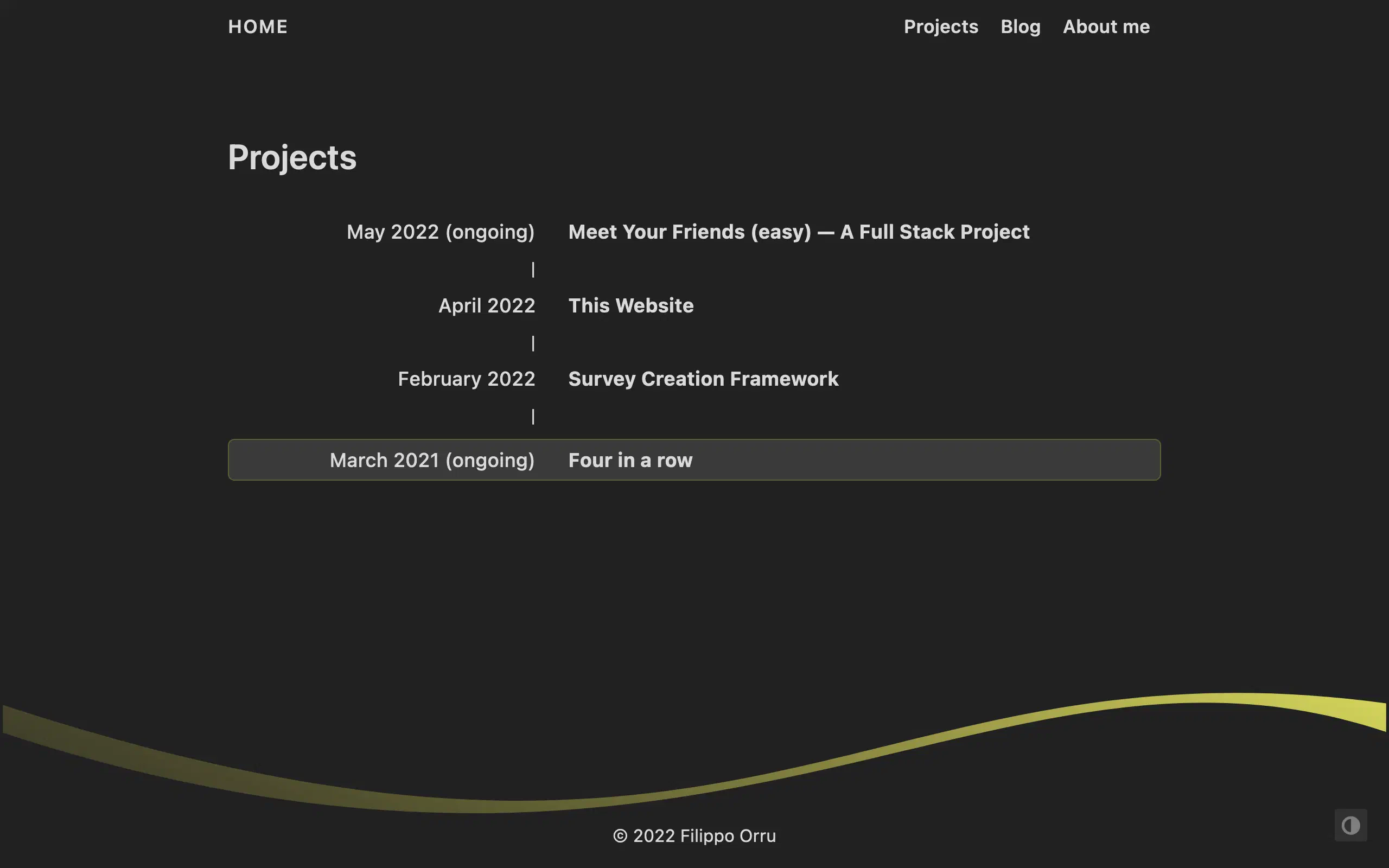
When someone visits my blog, I likely have at most one chance to show them something I wrote. Having all my work in one place maximizes the possibility that they find something interesting and keep reading.
# Finding a font that expresses what I feel
What I really like about Daniel’s logo font is it’s elegant and playful, without looking silly. He uses Tiempos Headline for the logo and article headlines, it looks graceful and has a strong contrast between its thinnest and thickest strokes. While searching for a font to call my own, I felt like choosing something even more “extreme” than Tiempos Headline. Searching through Google Fonts, I found Yeseva One, but we didn’t really click.
Then I found Bely Display.

Considering my blog had 23 unique visitors in the past 7 days (17 of which were me), the only thing I’m really willing to spend on it is my time. So finding out that a web license for Bely Display costs 35 USD stung a bit.
The search for a free alternative began. I tried fontspring’s Matcherator, which takes a screenshot of some text and returns a list of similar-looking fonts. This turned out to be quite sobering. None of the fonts, free or paid, compared to Bely. Most felt crude, not as sharp and expressive. The only somewhat similar font I could find is Nocturne Serif. I guess you just can’t beat love at first sight, so in the end I bought the license for Bely Display.

They say “to travel far, you need to travel together”, so the next step was finding a font for the body text and secondary headlines. I first landed on Merriweather after playing around with some fonts offered by Google Fonts. While I was writing this article, I switched the body font to Poppins. It fits the site better since it feels more modern and less clunky than Merriweather.
# Designing a logo for the home page
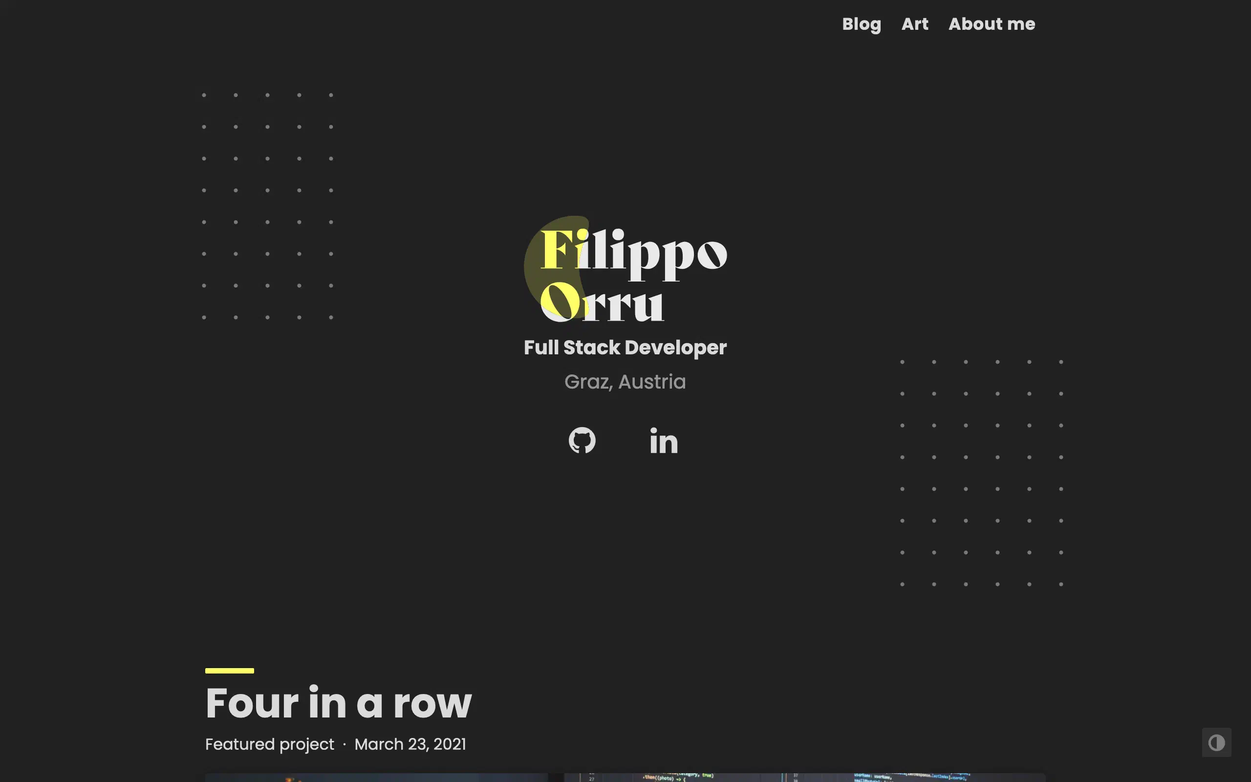
Having decided to use Bely as my expressive display font, I started creating a logo to replace the previous plain text. I started by drafting up some ideas on my reMarkable and then used Affinity Designer 2 to create the logo. It’s a simple two-lined text with a splash of yellow.
The site’s theme is based on hugo-coder. It’s free and supports both light and dark mode and has a minimal and clean look. A great starting point for customization. Most notably, the redesigned home page features the new logo in the center, which really draws attention to the name. Around it, I added some matrix dots inspired by a recent newsletter by Erik D. Kennedy.
There were some challenges while designing. I wanted the logo’s yellow splash to have different opacities on the text and on the background. But the overlay effects used for this are unsupported when exporting to SVG. This meant that the layers would get rasterized, defeating the purpose of exporting to SVG in the first place. So I used Affinity Designer’s new shape builder feature to split the yellow from the white text. This made for minimal SVG sizes after exporting, since everything is now reduced to simple curves with a background color.
# Good artists copy, great artists steal
Something that delighted me on Daniel’s page was a very small detail. When loading the page, a pastel colored bar between the article’s title and content appears.
This small animation adds a lot to the page’s vibe in my opinion. So I did what all great artists must do… I stole recreated the effect. Some tweaks for supporting both dark and light mode were necessary, now the bar appears above all post titles.
# A place for art
When I was younger, I regularly switched from one interest to another. From CGI to programming to UI design to illustration etc. Started many projects, but oftentimes my interests switched again before completing them. After finishing school, I was torn between studying CGI, 3D modeling and animation, or go for programming. I chose the latter and am quite happy, even though I no longer have as much time for creative pursuits.
However when I do create something, I’d like to showcase it somewhere just for fun. The arts needed a space on my personal page.
I drafted a page with a grid of images that lists all my art posts. I took some inspiration from Instagram’s layout and the portfolio page of the theme Kross. It doesn’t look crazy innovative, but why reinvent the wheel when a simple and familiar layout gets the job done?

Hugo makes it easy to compress images I supply. In the grid shown above, an individual image is never larger than 400x400 pixels. So when the page is built, all images are compressed to this size and converted to .webp, which makes for minimal file sizes and quick page loads. Of course, when viewing an individual artwork, the full-size image is used.
# Conclusion
So once again I’m spending more time on the page’s design than on its content. But since this is my personal space for expression and I genuinely enjoy tweaking every corner of this page, it’s fine. In general, when I come across something that really intrigues me or sparks inspiration, I get endlessly motivated to learn about it.
What a journey. I bought my first font and designed a logo with it. The home page got some love and I’m really happy with the result. Similarly, the list of blog posts looks much nicer, it feels more familiar and interesting. Small animations add little dots of delight and I’ve created a place where I can publish my art.
But as the saying goes, art is never finished. While writing this post, I created the image comparison widget that you see above and changed the site’s design so much that all screenshots had to be captured at least twice. I fully expect many more small and big tweaks to come.
# More
github.com/filippo-orru/personal-site-hugo
If you’re interested to see the behind-the-scenes, check out the repo!Comparing Survey Creation Platforms. I spent two months building a survey creation platform, deployed it to >300k users and compared it to Google Forms and SurveyJS.
Check out a recent art post of mine.